
The perfect website, part two: usability and conversion design
Most websites don’t have a goal. Pick one call to action, keep it on screen, and run every campaign toward it.
By Andy Bedell, founder of Discovery Marketing
Almost every website has weak copywriting. Most also have no real goal.
Every website needs a call to action: the one thing you want visitors to do. For an online store it’s easy: buy now. For professionals it could be one of several things:
- Download a guide on investing or tax strategy
- Schedule a call
- Leave your details and we’ll reach out
Each one ends with you getting their information and following up to learn what they need.
Keep the button on screen
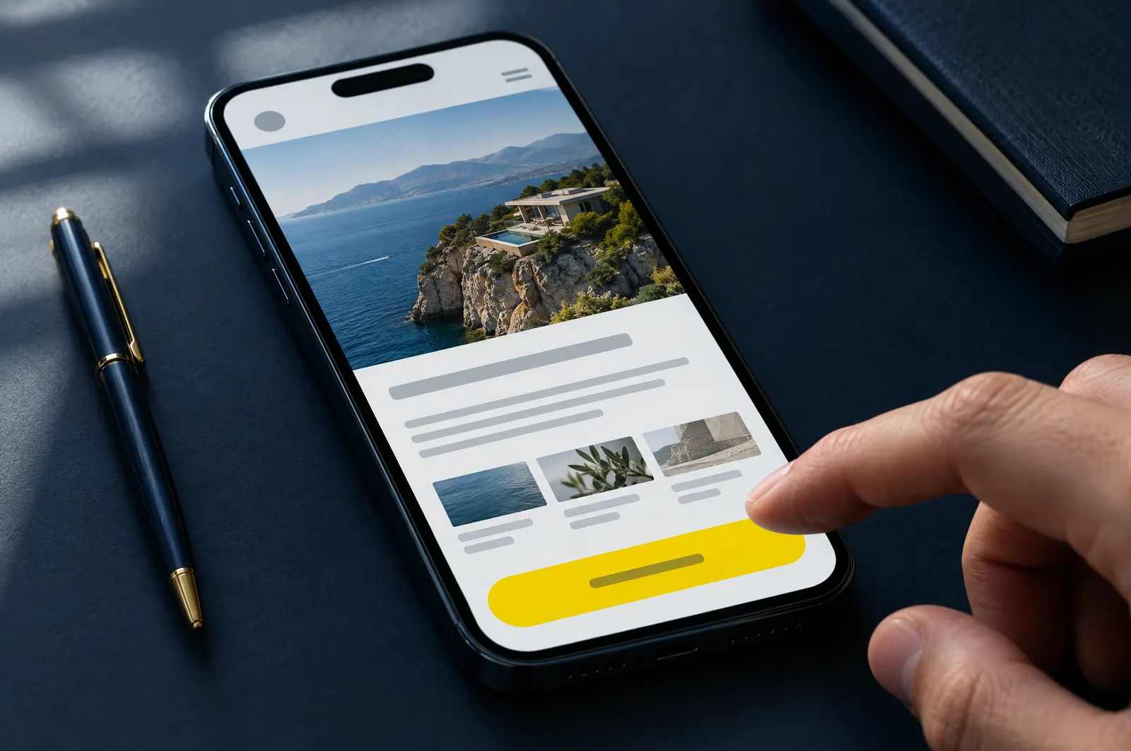
On the sites we design, the main call to action is always visible: a button in the header on desktop and a sticky bar at the bottom on mobile. Visitors should never have to hunt for where to click.
A secondary action like “watch the video” or “see how it works” can help, as long as it supports the main goal instead of competing with it.
Choose one call to action instead of several. It focuses your visitors’ attention and lets you run one coordinated campaign.